41 Color Constrast
What is Color Contrast?
Color contrast includes: hue, lightness and saturation of text, images, and background
File types: .doc, .html, .pdf, .jpg, .gif
What Role Does Color Play in the Delivery of Your Content?
When documents or web pages do not provide enough contrast between foreground elements (e.g., text, images) and background elements (e.g., color, watermark images), some students will have difficulty reading the content. Consider the following questions:
- Have you presented text- or image-based content on a colored or textured background? If so, you should:
-
- Confirm that there is sufficient contrast between your foreground content and the chosen background color or texture.
- Have you included links in your content? If so, you should:
-
- Confirm that the color of your web links is distinct from both your background color and the color of the surrounding text.
- Have you used color to convey concepts or information? If so, you should:
-
- Confirm that you are not using color alone to convey this information.
Before You Begin
Who Are You Doing This For?
This work supports students who:
- Have low vision
- Have poor contrast vision
- Are color blind and cannot differentiate between certain colors
- Are using a device with monochrome display
What Do You Need To Do?
Contrast
Students with low vision and/or a form of color blindness may have difficulty reading text that does not contrast enough with the background color you have selected. If the color palette you have adopted is too subtle (e.g., white text on a pastel background; medium-grey text on a light-grey background), the contrast between your foreground and background is probably insufficient for some students.
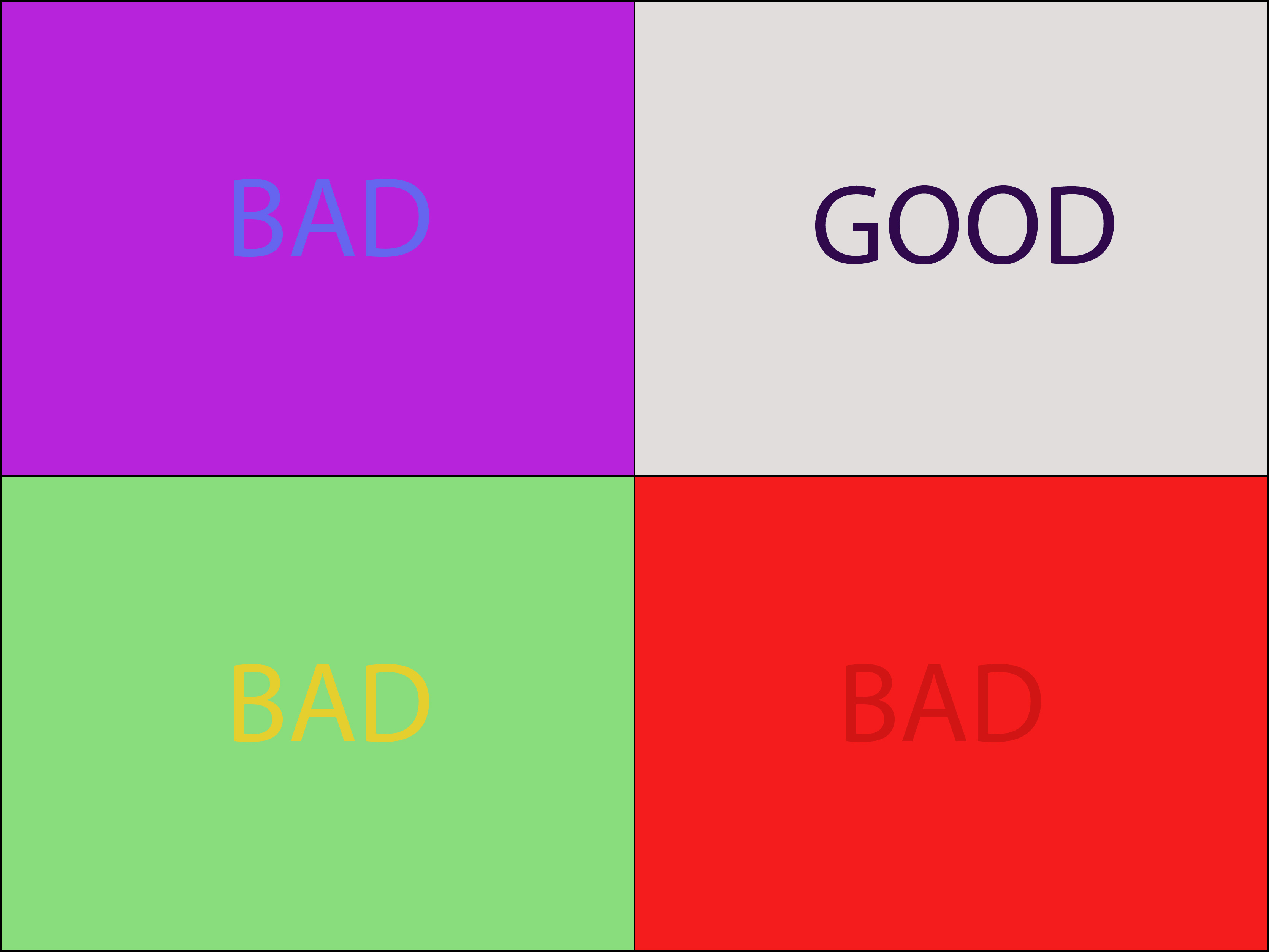
Web Content Accessibility Guidelines (WCAG 2.0) require that “the visual presentation of text and images of text has a contrast ratio of at least 7:1.”[15] The image below presents four different foreground/background color-contrast examples to illustrate insufficient and sufficient color contrast ratios.
Not sure how to test your materials for color contrast ratios?
There are many online and downloadable tools available to help you evaluate color contrast ratios. Here are a few we have tried and like:
WebAIM’s Color Contrast Checker: This web-based tool allows you to select or enter color values to test and provides you with a “pass” or “fail” on your contrast ratio.
ACART’s Contrast Checker: This is a straightforward, web-based tool you can use to both check color contrast and view your selections in grey scale. This tool also allows you to keep a history of the color combinations you have tested.
Giacomo Mazzocato’s Accessibility Color Wheel: This web-based tool includes several options for testing your color selections, including simulations of three types of color blindness. You can also opt to test what your contrast ratio is when the foreground and background color selections are inverted.
Weblink Colors
Weblinks must be visually distinct from both the surrounding, non-linked text and background color. If you do not underline your links (or provide some other non-color cue), you must ensure that you provide both sufficient contrast between the link and background colors and between the link color and that of the surrounding text.
Web Content Accessibility Guidelines (WCAG 2.0) require a:
- 4.5:1 contrast between the link text color and the background
- 3:1 contrast between the link text color and the surrounding non-link text color[16]
High-Contrast Mode
Some students need to see light text on a dark background for it to be readable, while others require dark text on a light background. Students with low vision must be able to see content when it is displayed in high-contrast mode. This can be a subjective experience, based on individual student needs. We recommend that you try testing your text and image-based content as you go by using high-contrast mode on your own computer and making adjustments as needed.
All content items such as text, images, bullets, and table borders must be visible in both regular and high-contrast modes.
Not sure how to test your content in high-contrast mode? To test the visibility of your content in this mode, turn on high contrast by simultaneously pressing the following keys on your (PC) keyboard:
Left ALT + Left SHIFT + Print Screen.
To turn off high contrast mode, repeat this step.
