36 Images
What Are Images?
Images include: photographs, diagrams, pictures, charts, graphs, maps
File types: .gif, .jpg, .png
Before You Begin
Why Are You Including the Images You Have Selected?
Before you can determine what you need to do to make an image accessible, you first need to identify its purpose or value to your open resources. Consider the following questions:
- Does your image serve a functional purpose? In other words, is it conveying non-text content to students? If so, you should:
- Does your image serve more of a decorative purpose? In other words, is it primarily a design element that does not convey content? If so, you should:
- Avoid unnecessary text descriptions
Who Are You Doing This For?
This work supports students who:
- Are blind or have low vision
- Have poor contrast vision
- Are color blind and cannot differentiate between certain colors
- Are using a device with monochrome display
- Have a form of cognitive disability
What do you need to do?
Functional Images and Alternative Text Description
Consider what your content page would look like if the images didn’t load. Now try writing alternative text for each image that would work as a replacement and provide the same service as the image.
As you work on developing your alternative text descriptions, keep the following recommendations and guidelines in mind:
- Remember that alternative text must convey the content and functionality of an image and is rarely a literal description of the image (e.g., “photo of cat”). Rather than providing what the image looks like, alternative text should convey what the content of the image is and what it does. [9]
- For relatively simple images (e.g., photographs, illustrations), try to keep your text descriptions short. You should aim to create a brief alternative (one or two short sentences) that is an accurate and concise equivalent to the information in the image.
- For more complex images (e.g., detailed charts, graphs, maps), you will need to provide more than a one- to two-sentence description to ensure all users will benefit from the content or context you intended to provide. In these cases, you should either provide the details in the text surrounding the image or write a longer text description that students can link to on a separate page. You should still include a short text description (one to two sentences) that tells students where they can find the details you have provided in the longer description.
- Leave out any unnecessary information. For example, you do not need to include information like “image of…” or “photo of…”; assistive technologies will automatically identify the material as an image, so including that detail in your alternative description is superfluous.
- Avoid redundancy of content in your alternative description. Don’t repeat the same information that already appears in text adjacent to the image.
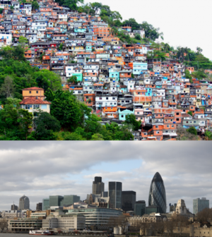
Example 1: (from Introduction to Sociology)
This photograph could be described in this way:
|
“Figure 20.11 includes two photos. The first photo shows crowded buildings located on the hillside. They are small and shabby. The second photo shows magnificent buildings located by water.” |
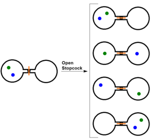
Example 2 (Figure 18.1. Two-Atom, Double-Flask Diagram from Introductory Chemistry):
When the stopcock is opened between the flasks, the two atoms can distribute in four possible ways.
Figure 18.1 could be described as follows:
|
“Figure 18.1 shows a diagram with five pairs of circles. All of these circles are open. The left one opens on the right and the right one opens on the left. They are connected with lines at their open points. One pair is located on the left and between their two connecting lines is a black dot with a red vertical line going across. The other four pairs arranged in a column are located on the right and between the connecting lines of each pair is a a small circle with a red horizontal line going through. A right arrow labelled Open Stopcock links the pair sitting on the left to the four pairs on the right. Each of these five pairs has two dots (green and blue) arranged in different patterns. For the pair on the left, the two dots, sitting obliquely, appear only in left circle. The green dot is at the left upper part of the circle and following it the blue dot is close to the bottom right. The first pair on the right has the similar situation. The only difference is that the green dot is at the right upper part of the circle and the blue dot is close the middle left. The second pair has a green dot in the centre of the left circle and a blue dot in the centre of the right circle. The third pair has a blue dot sitting at the left upper part of the left circle and a green dot sitting close to bottom right of the right circle. For the last pair, the two dots appear in oblique direction only in the right circle. A green dot is at the right upper part of the circle and a blue dot is close to bottom left. ” |
Using Color
Consider what your images would look like if they only displayed in black and white. Would any necessary context or content be lost if the color was “turned off”? Images should not rely on color to convey information; if the point you are making depends on color to be understood, you may need to edit your image or formatting so that concepts presented are not lost to those who are color blind or who require high contrast between colors.
Example 1 – not accessible: In this basic bar chart, color is the only means by which information is conveyed.
Example 2 — not accessible: For a student who is color blind or who has poor contrast vision, all of the relevant information is lost in a color chart.
Example 3 — accessible: Students who are color blind can distinguish between high-contrast shades. In this example, contextual labels have been added to each bar at the bottom of the chart. Note that the chart will still require an alternative text description.
Decorative Images
If your image does not add meaning and is included for decorative or design purposes only, the space for the alternative text description should still be included with your image, but it should be left empty or blank. Assistive technologies will detect the image, and by leaving the alternative text description blank, you will signal to the student that there isn’t any contextual content embedded. Including alternative text descriptions for decorative images “simply slows the process down with no benefit because the screen-reading software vocalizes the content of the [alternative text description], whether that alternative text adds value or not.”[10]
How to name your image files
It is important that folders are named in a consistent and logical manner so they can be easily located, identified, and retrieved as quickly and easily as possible. This ensures an efficient process of getting the textbook down.
The most important step in naming files is consistency. Maintain the same name and frequently update version numbers when uploading newer/updated files into Box. This way, faculty and students can keep track of the latest and oldest files.
Use capital letters to delimit words, not spaces or underscores.
Example: Img001, Img002, Img003, Img004
This way is preferred as it reduces the length of the file name, but also still differentiates them by capitalizing the letters and making it recognizable.
For file names with numbers, always give it a three-digit number rather than one.
Example: Chart 001, Chart 002, Chart 003
To maintain the numeric order when searching for file names with numbers, it’s best to include the zero for numbers between 0-9. This will help retrieve the latest or earliest photo. It’s best to keep it a three-digit number, as some of the OER’s textbooks can be lengthy.
When applying a version number, it should always appear in the file name so it can easily be found and accessed.
Example: Table001V01, Table001V02, Table 002V01, Table 002V02, Table 003V04, Table 003V05
Some photos and information goes through a different number of versions. In order to find the most recent, it is best to label it as so. It’s good to keep in mind that the version number should be listed at the end. Usually the most recent version will be inputed into the final figured folder.
If the file has a specific name, it’s best to put that name in the middle between the figure number and the version number. This way the file name could be easily identified without confusion. It’s not always required to put the picture’s name in the middle, but it could help locate the image if there are many figures in a folder.
Example: Table003VOlcanoPictureV01, Table002HotdogPictureV02, Fig001BigGraphV03
What to avoid when naming a file
Do not save files containing these characters * ; / \ < > | ” ” ? = + & $. These characters can make it difficult when searching for files.
When naming a folder
This naming convention doesn’t only apply to figures and documents but also to folders. When naming a folder the same rules can be applied.
Example: FinalFigures, CH003, CH002, ImageFoldersV01
Skin color palette for illustrations
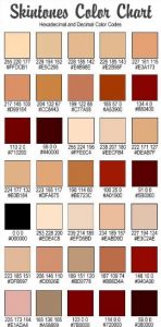
The colors “Nude”, “Brown”, “Tan”, “White”, and “Beige” are all skin tones that expand past fashion but also in society in order to embrace diversity. Neutrality is attributed to these colors that represent skin tone. Many hex codes on skin tone can be found, but it’s preferred to use the ones in the sources as they are more closely accurate with research as a source.
Nude RGB: #E3BC9A
Brown RGB: #964B00
Tan RGB: #D2B48C
Beige RGB: #F5F5DC


